.
Bath & Body Works Packaging
.
Project to design an allergen friendly skincare line for Bath & Body Works. This fills a gap in their existing products, since the majority of their existing skincare contains allergens. The project involved the creation of three individual packaging designs for Neapolitan-inspired body creams.
The goal of the project was to create packaging with a simple design that is clear and communicates the use of safe, all natural ingredients.
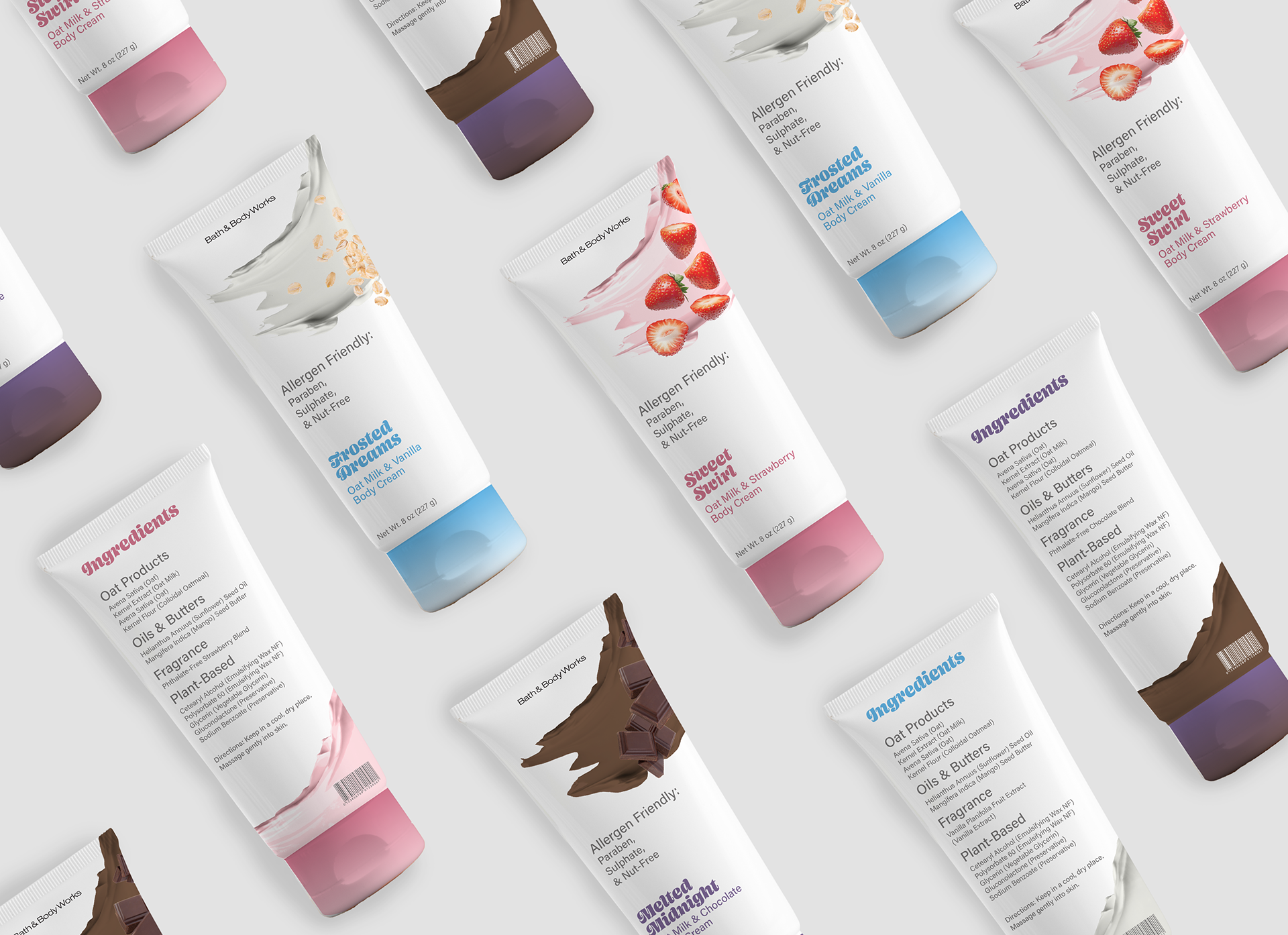

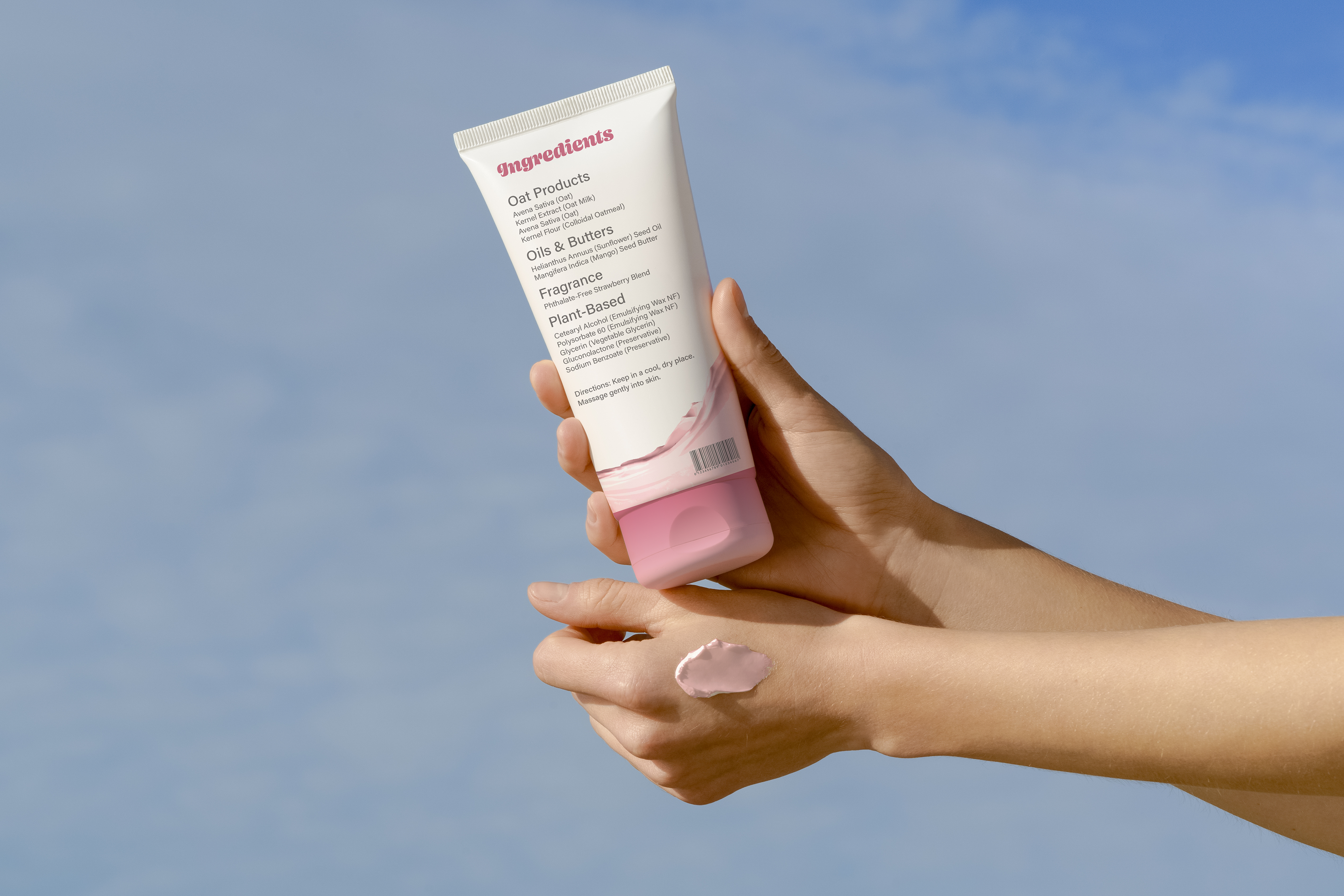
The label displays the absence of common allergens to ease customer concerns, while the swatch of cream shows the appearance of the product

The color of each cap corresponds to each body cream's scent. Blue conveys neutrality and simplicity, qualities often associated with vanilla; pink symbolizes the strawberry scent; and purple communicates the luxuriousness associated with the chocolate scent.
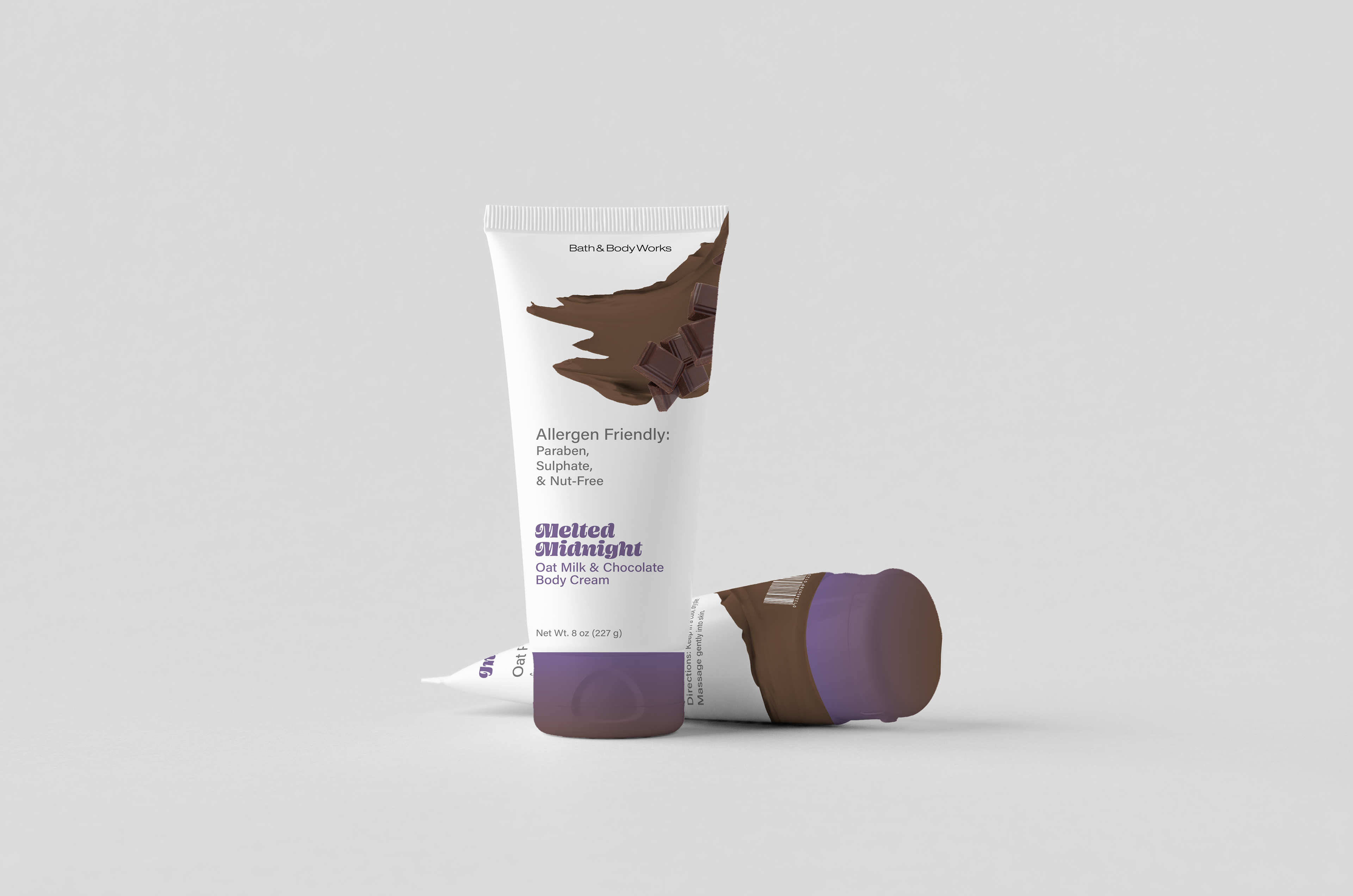
A simple sans serif conveys information clearly, while a bold, decorative typeface adds visual
interest to the otherwise minimalist design
interest to the otherwise minimalist design
.
3 Packaging Designs
Packaging Design, Wellness Design
Tools: Adobe Illustrator, Photoshop
Packaging Design, Wellness Design
Tools: Adobe Illustrator, Photoshop