.
National Park Service
App Redesign
.
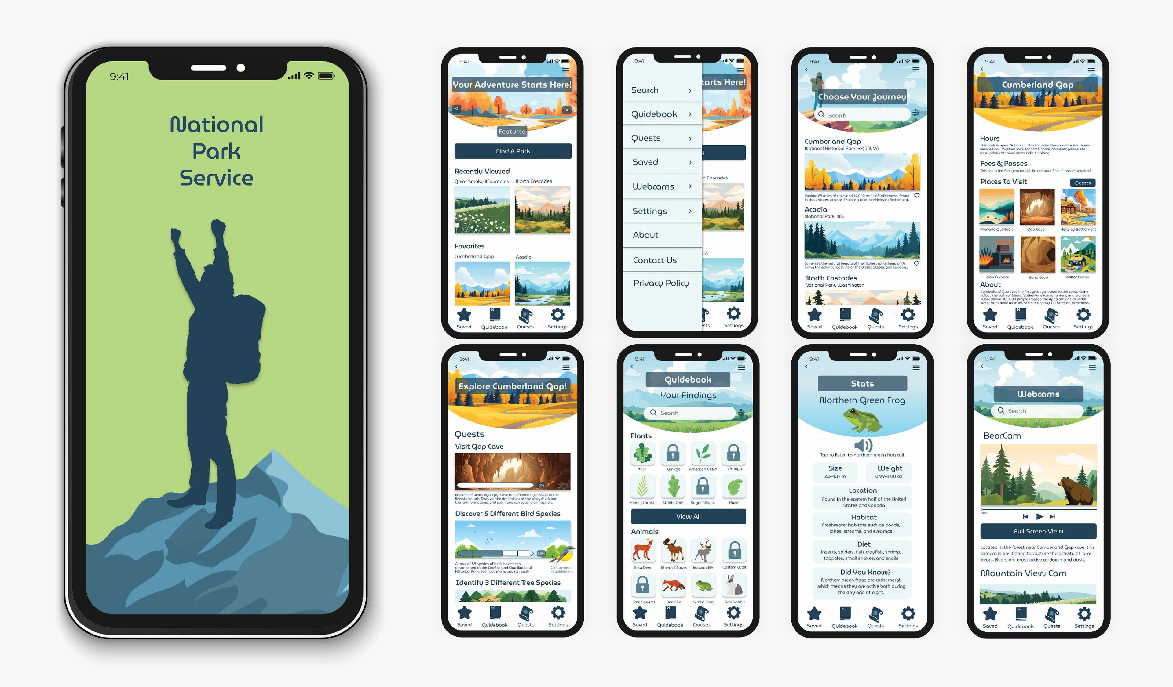
A redesign of the National Park Service brand identity & app that involved organizing existing content in a more user friendly & visually interesting way.
The goal of the project was to modernize the identity & app, make it more user friendly, & appeal to all ages by including elements of gamification.
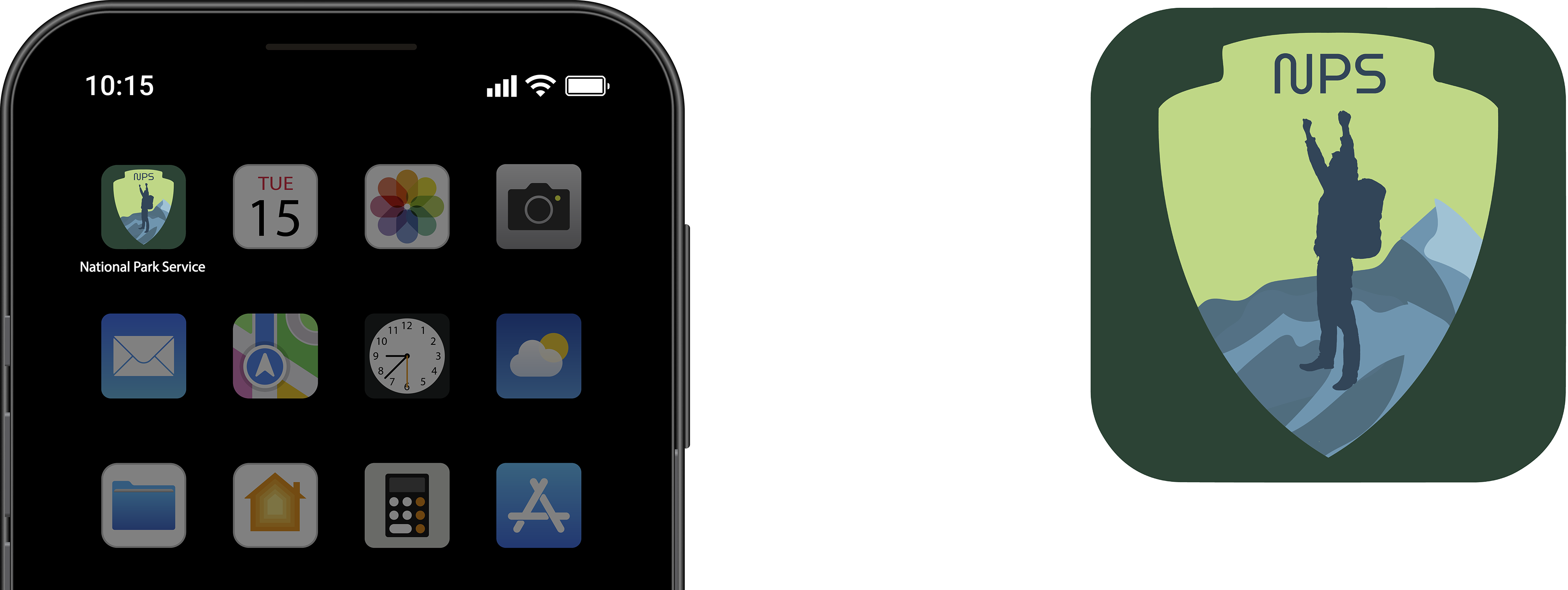
App icon redesigned with a bolder shield logo & more saturated colors to appeal to all ages while still representing nature
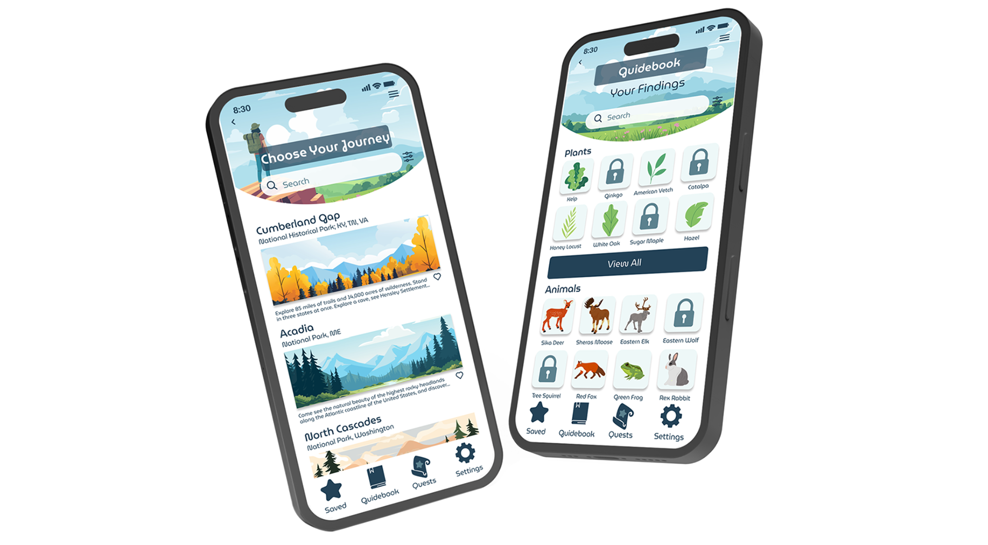
The concept behind the redesign was to resemble an augmented reality game, appealing
to kids and family through more interactive elements.
to kids and family through more interactive elements.
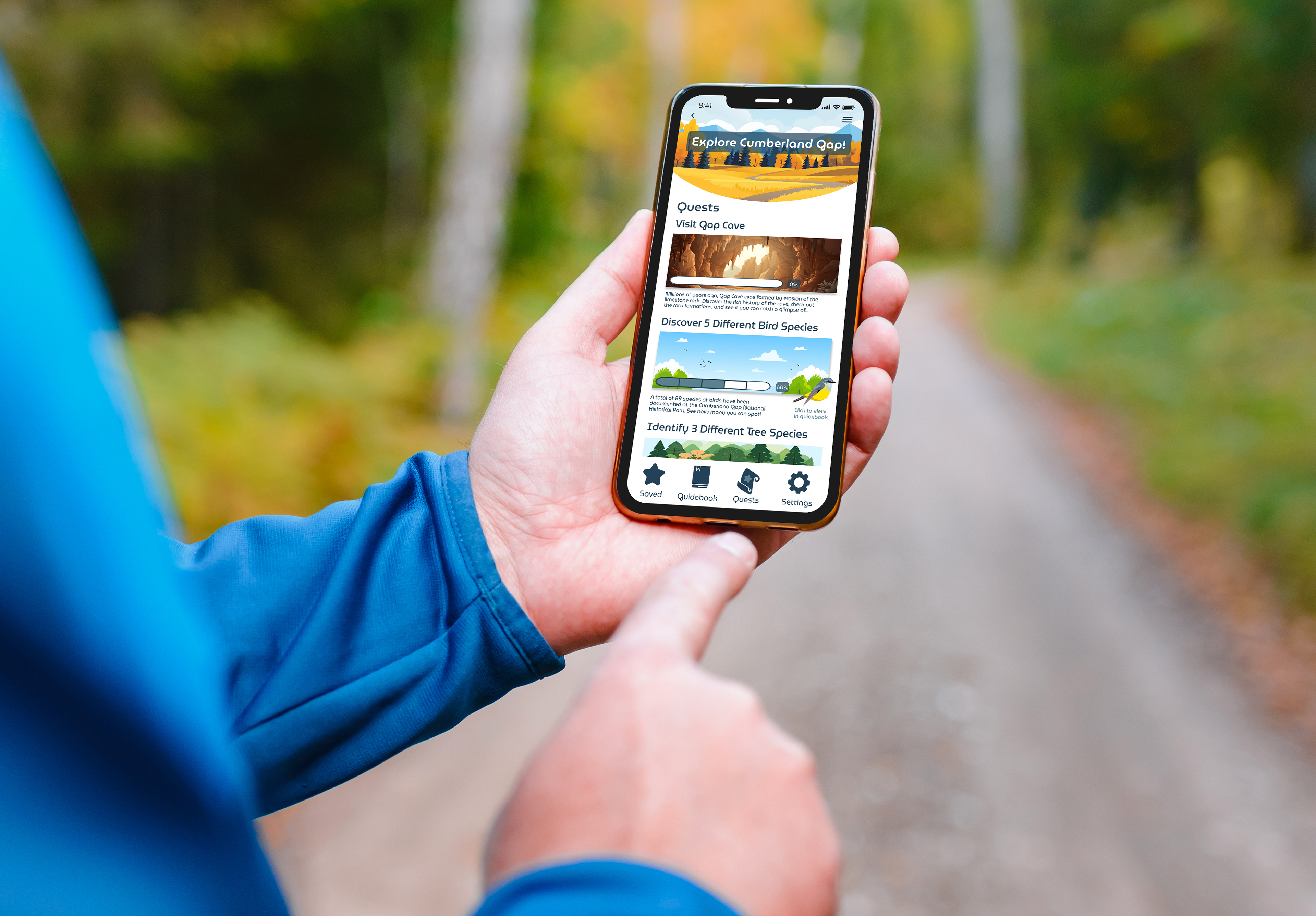
The Quests screen presents information in an exciting way using elements of gamification, encouraging users to actively learn about natural sights.
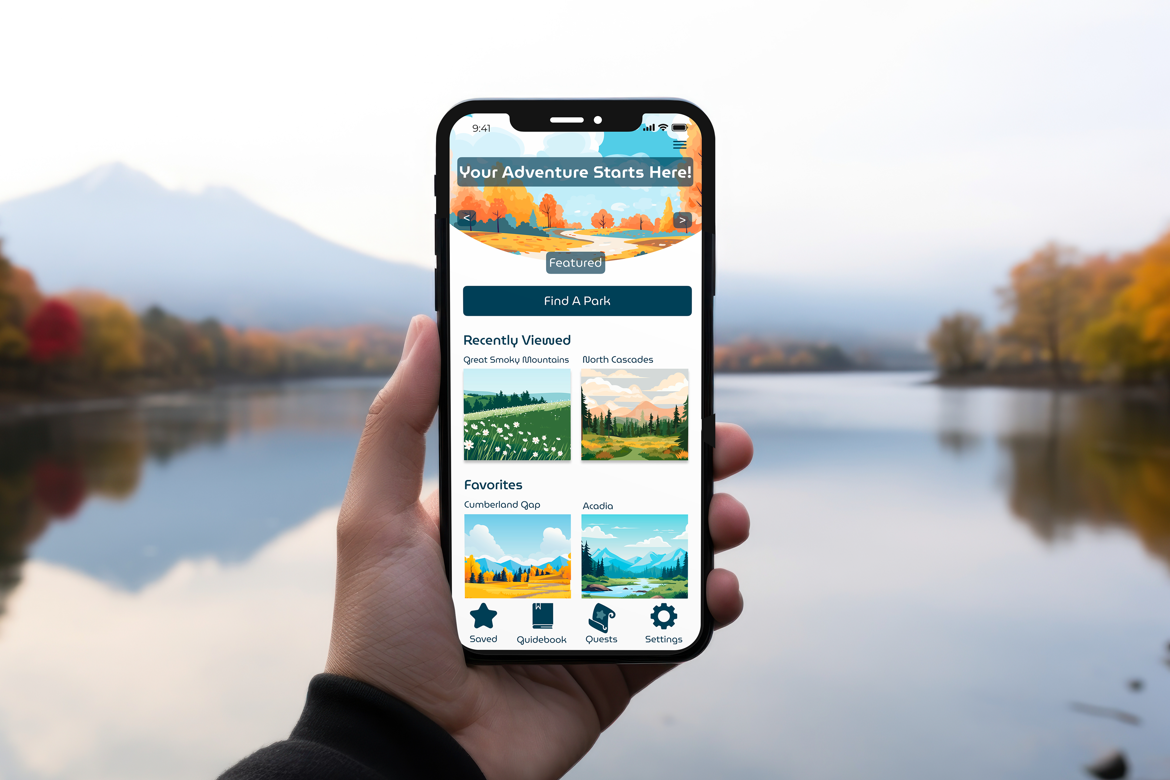
Typeface was chosen to reflect organic shapes seen in nature in a modern way
.
App Redesign
UX/UI Design, Visual Identity
Tools: Figma, Adobe Illustrator, Photoshop
UX/UI Design, Visual Identity
Tools: Figma, Adobe Illustrator, Photoshop